CSS buttons
Rollover buttons & icons with CSS
The goal was to create buttons for an intranet using CSS. These buttons are composed of a background image, an icon and a label. To allow for flexibility and save bandwidth, the same background image is used for all buttons, and the icon is chosen depending on the id of the button.
The styles of this website might interfere with the look of the button, check it in a separate window. You can view the CSS file or download it along with the button images.
Button shape
To create the button, we’ll use a <a href> html tag. Internet Explorer for Windows will only apply :hover behaviour to this tag, so we won’t have to write javascript to simulate the rollover effect. The html code will be:
<a href="javascript:return false;" class="button" id="buttonOK"><span class="icon">Ok</span></a>
The “javascript:return false;” part will be replaced by a link or a javascript function. The button has its ID set to “buttonOK”, and inside is a span which will be used to “hook” the icon.
That’s all the html we’ll use, everything else happens in the CSS file. First we’ll use the “button” class to give all buttons their common features. We’ll do the same for the “buttonDis” class (we’ll use this class when we want to disable a button).
a.button, a.buttonDis {
display: block;
background-color: transparent;
background-image: url(buttonBackground.gif);
background-repeat: no-repeat;
width: 132px;
height: 28px;
margin: 5px auto;
padding: 5px 0 0 0;
text-align: center;
font-family: Helvetica, Calibri, Arial, sans-serif;
font-size: 100%;
font-weight: bold;
text-decoration: none;
}
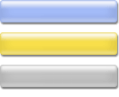 The link is set to be a block element of 132×28 pixels (which matches the background image size), and we use the “buttonBackground.gif” image, without repeating it. Here’s this image on the right.
Inspired by the Fast rollovers, no preload needed technique described by Petr Stanicek [aka -pixy-], this image contains the three button states: normal, hover and disabled, so that we won’t have any loading delay when we mouseover the link. They are spaced so that one won’t accidentally show under another.
There’s one drawback to this technique, which John McDaid points out: if an Internet Explorer user has his/her settings in the “Options”>“Temporary Internet Files”>“Settings”, “Check for newer versions of the page” panel set to “every visit to the page”, he/her will experience weird flickering and delay when mousing over and out of the button. The solution described in Petr’s document would consist in adding one more element wrapping around the link, and use the background image in its hover position for this element.
The margin settings allow for vertical space around the button, the padding moves the icon of the button and text down. The button text is then centered, its font set and styled (as it is a link, the default underline is removed).
Button background behaviour & colour
We’ll then set the button behaviour through the :link, :visited, :hover and :active states of the links:
a.button:link, a.button:visited {
color: #002577;
}
a.button:hover, a.button:active {
background-position: 0 -36px;
color: #FF7200;
}
The :link and :visited selectors define that the button text is the same colour if it’s been previously clicked or not. As we didn’t set the “background-position” property in the a.button selector declaration, the image is positioned at the top left of the button block in both states.
The interesting part happens in the :hover and :active selectors, for the rollover and active (just clicked) states of the button. Using the “background-position” property, the background image is moved to reveal the yellow background and the text colour is set to orange.
Here’s the CSS code for the disabled button:
a.buttonDis:link, a.buttonDis:visited, a.buttonDis:hover, a.buttonDis:active {
background-position: 0 -72px;
color: #5F5F5F;
cursor: default;
}
The disabled button remains the same in all four states. The background image has been moved up 36pixels more so that it is now grey, the text colour is dark grey and the cursor retains its default state, meaning it doesn’t turn into a “hand” when you move your mouse over the button:
Here’s the html code used for this disabled button (in the “real world”, you’ll use javascript to switch the button class from “button” to “buttonDis” to disable it).
<a href="javascript:return false;" class="buttonDis" id="buttonImport" title="You can’t use this button"><span class="icon">Import</span></a>
Button icon behaviour
 We have wrapped the text of the button in a <span> with a class “icon”, we’ll use this class to add the icon and its behaviour.
As the button background, the icons use an image with three states of the icon, antialiased on the corresponding button background colour. On the right is the “Ok” icon.
.icon {
background-repeat: no-repeat;
padding: 0 0 5px 18px; }
The background image will be set later, but is set so that it doesn’t repeat itself.
The padding is set to be zero on the top and right, 5px at the bottom and 18px on the left where it makes room for the icon before the text appears in the span.
a.button:hover .icon, a.button:active .icon {
background-position: 0 -28px;
}
a.buttonDis:link .icon, a.buttonDis:visited .icon, a.buttonDis:hover .icon, a.buttonDis:active .icon {
background-position: 0 -56px;
}
The rollover effects use the same background image positioning technique as the background of the button: the icon is moved up 28pixels when the button is in a :hover or :active state, displaying the orange icon.
The icon of the disabled button is positioned 56pixels up for all states (the grey icon is displayed).
An icon for each button
The previous code has set a button and disabled button behaviour shared by all buttons. We’ll just have to set the background image file for each type of button to get a different icon:
#buttonOK .icon {
background-image: url(ok.gif);
}
#buttonCancel .icon {
background-image: url(cancel.gif);
}
#buttonImport .icon {
background-image: url(import.gif);
}
Using IDs, we choose a different icon file for each <span> with a class “icon” in the buttons. You’ll have to create two different IDs with the same icon file in order to get two “OK” buttons in the same page, as IDs must remain unique.
You Don’t have to design a fixed width button, you could use a repetitive background and borders to create “fluid-width” buttons with the same icon and label technique.